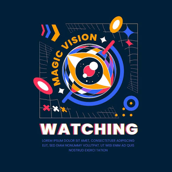
Creative lettering can turn a simple poster into something people notice right away. Whether you are making a school poster, party sign, event banner, or social media graphic, lettering gives your design personality. Even a single design like R in bubble letters can become a bold focal point when you use the right shape, outline, and decorative details.
Why Creative Lettering Matters for Posters
Lettering does more than display words. It creates a mood and helps people understand the purpose of your poster before they read every detail.
Large, bold letters can communicate excitement, while soft handwritten letters can create a friendly feeling. The best lettering style should support the message instead of making the poster difficult to read.
A strong poster usually has a clear visual order. The main heading should attract attention first, followed by supporting text and smaller details.
Use Bubble Letters for Bold Headlines
Bubble letters are a popular choice for posters because they look playful and stand out from a distance. Their rounded shapes make simple words appear larger and more interesting.
You can create bubble letters by first writing normal block letters. Draw a rounded outline around each letter and then erase the original guide marks.
Adding a thick outer border can make the letters even stronger. You can also use small highlights inside the letters to create a shiny or three-dimensional effect.
Try Shadow Lettering
Shadows are an easy way to give ordinary lettering more depth. Write your heading first and then repeat part of each letter slightly to one side.
Keep the shadow direction consistent across every letter. This small detail makes the complete design look cleaner and more professional.
You can experiment with short shadows for a simple effect or longer shadows for a dramatic poster style. Shadows work especially well with thick block and bubble fonts.
Combine Different Lettering Styles
Using only one lettering style can sometimes make a large poster feel plain. Combining two or three styles creates contrast and helps separate different types of information.
For example, use large bubble letters for the title and simple handwritten text for supporting details. You can also combine uppercase block letters with a small cursive subtitle.
Avoid using too many different styles on one poster. Two main lettering styles are often enough to create variety without making the design confusing.
Add Patterns Inside Your Letters
Patterns can transform basic letters into decorative artwork. Instead of filling letters with one solid design, add dots, lines, stars, waves, hearts, or simple geometric shapes.
These details work particularly well inside thick letters because you have more space for decoration. Keep the pattern simple enough that people can still recognize each letter quickly.
You can also change the pattern from one letter to another. However, repeating one design across the whole word usually creates a more balanced appearance.
Experiment With Bubble Lettering Ideas
There are many bubble lettering ideas you can use when designing creative posters. You can try overlapping letters, double outlines, small highlights, curved shadows, decorative borders, or different letter sizes.
Another creative option is to place tiny drawings around the letters. Stars, flowers, clouds, hearts, lightning bolts, and simple doodles can make the heading more attractive.
You can also make individual letters look like objects. For example, a letter could have a cloud-like shape, floral decoration, or comic-inspired design while still remaining readable.
Create a 3D Lettering Effect
Three-dimensional lettering can make your poster heading appear to come off the page. Start with thick letters and draw matching lines extending from their edges.
Connect those lines carefully to create the illusion of depth. Keeping all depth lines in the same direction will make the effect look natural.
You do not need advanced drawing skills for this technique. Basic block letters with a simple 3D extension can already make a poster look much more dynamic.
Use Handwritten and Brush Lettering
Handwritten lettering gives posters a personal and creative appearance. It works well for quotes, inspirational messages, classroom projects, and handmade signs.
Brush-style lettering uses a mix of thick and thin strokes. Downward strokes usually appear thicker, while upward strokes remain thinner.
If you are working digitally, many design programs provide brush-style tools. For handmade posters, markers with flexible tips can help create a similar appearance.
Decorate Letters With Small Illustrations
Letters do not always need decoration inside them. You can place small illustrations around the heading to create a complete visual theme.
A summer poster might include suns, waves, or palm trees. A school poster could feature pencils, books, stars, and notebooks.
Choose illustrations that connect naturally with the topic. Random decorations can distract readers instead of improving the design.
Play With Letter Size and Position
Every letter does not need to have exactly the same size or position. Slight changes can create movement and make a heading feel energetic.
You can make important words larger while keeping less important words smaller. Another option is to arrange letters along a curve instead of placing them on a straight line.
However, readability should remain your priority. Creative positioning works best when viewers can still understand the message immediately.
Outline Important Words
Outlining is one of the simplest techniques for improving poster lettering. A thick outline separates letters from the background and makes the heading easier to see.
You can use one outline or create several layers around the letters. Double outlines work particularly well with large bubble and block lettering.
For busy poster backgrounds, stronger outlines can prevent the words from disappearing into surrounding illustrations and decorations.
Keep Enough Space Around Letters
Good spacing can make even basic lettering look professional. Letters placed too close together may become difficult to recognize, especially from a distance.
Leave enough space between letters, words, illustrations, and other poster elements. Empty space gives the design room to breathe and helps important information stand out.
Before finishing your poster, view it from several steps away. If you can quickly read the heading, your spacing and letter size are probably working well.
Match Lettering With the Poster Theme
The best lettering style depends on the purpose of your poster. A playful birthday poster may look great with bubble letters, while a formal event may need cleaner and simpler typography.
Think about your audience before choosing a style. Children may enjoy rounded letters and doodles, while professional audiences often prefer bold and minimal designs.
Your lettering, illustrations, layout, and overall theme should work together rather than competing for attention.
Final Thoughts
Creative lettering gives you many ways to make an ordinary poster more memorable. Bubble letters, shadows, patterns, 3D effects, outlines, handwritten styles, and small illustrations can all add personality without requiring complicated design skills.
Start with a clear message and experiment with a few bubble lettering ideas or other creative styles that fit your theme. Keep the letters readable, maintain good spacing, and use decoration carefully to create an eye-catching poster that communicates its message clearly.